Using the Concept of Ansel Adams Zone System for Black and White Digital Images
or An Exercise in Visualization
The intent of this article is not to describe how to use Ansel Adams' Zone System to take photographs. What I want to show is how you can use the concept to adjust the gray tones in an image through the use of Photoshop's Curves. I have read a number of articles where people used this concept. What I plan to show is a way to adjust certain tones of gray basically independent of others. This article is more of an exercise in visualization. I say this because I could always use the Eye Dropper in Photoshop to find the area on the Curve's diagonal line, but I had trouble visualizing where the different gray areas were.
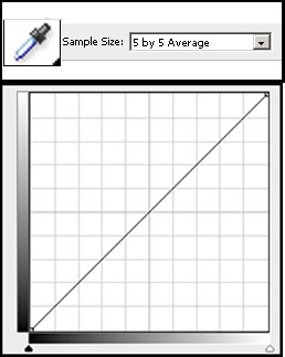
I use different sample sizes for different purposes. For this a 3 by 3 Average or the 5 by 5 is good to sample the gray tone on an image. A point sample, in this case, could be misleading.
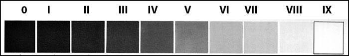
First let me show Ansel Adams' Zone Chart. It is taken from page 14 of The Negative by Ansel Adams, New Revised Edition, Morgan & Morgan, Inc., 1971.
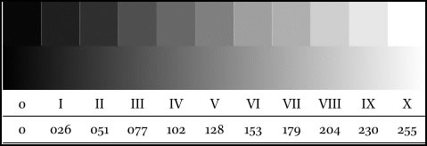
All Black and white images should have black and white in them. How the gray is arranged depends on the image. When Ansel Adams photographed his images and printed them, he made sure that different levels of gray were represented. Below is a scan from the same book mentioned above of part of page 19.

As noted his system is made up of 10 zones, 0 being the first or darkest and 9 being glaring white.
Recently I read in a magazine where Ben Birchall took the Adjustment Curve in Photoshop and, using the grid with 10% increments on the diagonal, likened it to Ansel Adams' Zone System.
Then, in looking through different websites, I found reference to a Zone System attributed to Erik Heyninck. (I could not find a direct reference in any of the websites that referred to Erik Heyninck.) It contained more zones than did Ansel Adams' system, but it also contained reference numbers for shaded of gray from 0-255.
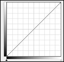
These numbers were the intersections on the Adjustment Curve.
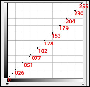
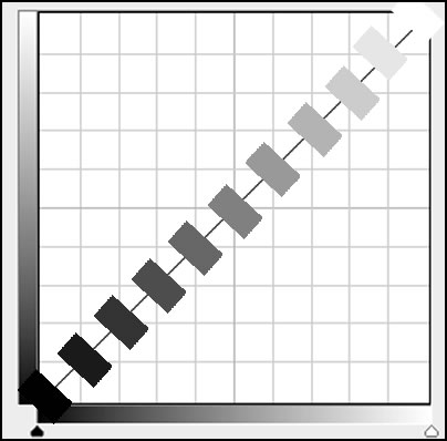
To visualize it, I, also, created the areas of gray. This is just a visualization because the exact color would only be a dot on the line since the shade of gray will change as it moves on the diagonal as well as below or above it.
With this curve, which I saved without the numbers of course, I can control areas of gray more precisely. To use it I just load it in the Adjustment Curve. (You can save custom curves.)

Notice, if I lighten Node III, it will not lighten very much of the adjoining gray areas. Following the chart, I can select a gray area with the eye dropper and find where it is on the chart.
Could I do this without creating the points on the Adjustment Curve ahead of time? Yes. But going through this exercise gave me visual points of reference. It is also easier to adjust the nodes when there are many of them.
Just going though this exercise, which anyone can replicate, gave me a more precise visualization of the curve and where the actual shade of gray fell.