Why Calibrate Your System?
An Update and Expansion of my other Articles on Color
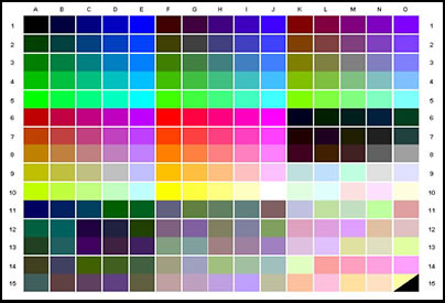
Over the years I have written a number of articles that dealt with color as well as monitor and printer calibration. I have decided to update some of my past articles as well as include other information. Recently, somebody came to me with a problem. She was sending her images off to a service bureau and when they came back they did not resemble her image as it appeared on her monitor. The service bureau stated that all their equipment was calibrated. She brought her image over to my house and I put it on my calibrated monitor. It looked like the prints she was getting from her service bureau. What was her problem? Her laptop had a hue. My expensive Dell also had a hue when I first got it. At that point the software for the NVIDIA Quadro FX 1500 was non-existent for the laptop. (Later it became available in an update.) So in order to see my images correctly, I had to calibrate my monitor. This is just one type of example. What does calibration entail? It entails taking what should be and what is and creating a profile so what is becomes what should be. Below is an example having to do with creating a printing profile. The Spyder3Print software by Datacolor comes with a target image called Pure Color, in this case.
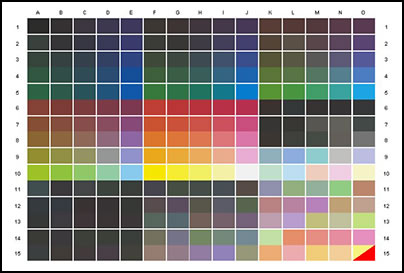
One then prints a target on the printer without color management and measures those values.
Notice the differences. The profile that will be generated will take the value of the measured colors and use the values of the pure colors as the goal. This is not a technical description. But you get the idea. The same is true of a monitor. One sets a goal for the monitor of color temperature and gamma. The Colorimeter is a piece of hardware which measures the information generated by your monitor. It is best to restore the controls to the factory default state. The profile takes what is and creates a bridge to what should be. Again, this is not a technical definition but a descriptive one.
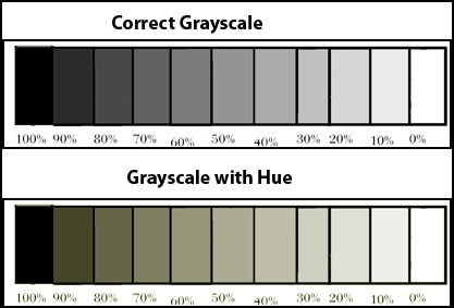
Basically you want your monitor to have a consistent grayscale group of patches from 255 (white) to 0 (black) in RGB or in grayscale from 0% (white) to 100% (black). You don't want them to have a color caste. There are two examples below. As you read this on your monitor, the "Correct Grayscale" should show neutral grays while the "Grayscale with Hue" should show greenish-yellow patches.
One needs to understand how the colors relate to each other and how they look different in different color spaces. Many of the colors will look slightly different in the various color spaces. Below is an exaggeration of how red looks in different color spaces. Color space is a system for describing color numerically. It is also known as a color model. A working space such as Adobe RGB 1998 or sRGB in Photoshop describes the colors that are available for the image. Other colors will be out of gamut.
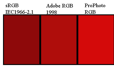
The sRGB color space has the smallest gamut. Many peripherals use this as the color space. According to some authorities, this space lends itself to the web better than the others. Adobe RGB 1998 has a mid-range color gamut; while ProPhoto RGB has the largest gamut, but you need to use 16-bit to avoid banding which you get from 8-bit. The ProPhoto RGB space allows for more saturated colors. According to author, Jeremy Daalder, http://www.jeremydaalder.com/singleArticle.php?articleID=6, most monitors can only show 98% or the Adobe RGB 1998 gamut and printers also have a similar restriction.
The reason some people want to work in ProPhoto and embed profiles is for the future. When in the future? Who knows. Also, to work in 16-bit increases the file size. The file size will be twice as large.
Additive colors are the colors that are inherent in light. They are the colors indigenous to monitors, digital cameras, and scanners. The human eyes, also, sees these colors. They are red, green, and blue (RGB). They are called primary additive colors because when added together, they form white.
Subtractive colors are those used in the printing trades such as dyes, inks, and pigments. I am sure the term four color separation is familiar to many people. These colors are cyan, magenta, and yellow. These colors are called absorbing or subtractive colors since when light is absorbed by all of them, they produce black. These are the colors used in printers. They are commonly referred to as CMY colors. However, usually one sees CMYK. K stands for a truer black since when 100% of C, M, and Y are combined, the resulting color is a muddy dark brown. All of these colors are related. For example:
     white = red + green + blue        black = cyan + magenta + yellow
     cyan = green + blue               red = yellow + magenta
     magenta = blue + red              green = yellow + cyan
     yellow = red + green              blue = cyan + magenta
I hope that the above lists show an emerging pattern - one of interrelationships. RGB and CMY colors form a complementary relationship.
                             Red.........Cyan
                             Green......Magenta
                             Blue........Yellow
Thus, if I have an image that contains yellow and I want to intensify the yellow, I can add more yellow or I can subtract blue. The best way to understand complementary colors is to set up an image and manipulate the individual colors.
Computers are capable of generating images of varying numbers of colors. These can range from 16 colors to 16 million colors or from 8-bits per channel to 32-bits per channel or more. (Video cards used to be set for the number of colors; now mine, at least, lists bit depth instead.) If an image is created with only 16 colors and this image is turned into a grayscale image, there are only a certain number of shades of gray possible. Likewise, if an image that has 16 million colors is turned into a grayscale image, there are many more shades of gray even though the human eye cannot discern them all. How can the computer vary the number of colors or shades of gray? The computer monitor is made up of red, green, and blue phosphors or light producing elements. Each of the colors associated with a pixel (picture element) can have attributed to it a certain number of colors. Bit-depth determines how many colors or levels of gray each pixel carries. In scanning for example, a bit-depth of 24 means that the red, green, and blue sources of light each have 8 bits of color assigned to them. The more color bits assigned to a pixel, the more colors can be displayed and, theoretically, the more shades of gray. However, the human eye can only see a certain number of shades of gray. Also, not all visual colors can be transmitted to the printed medium. Thus, for example, when a scanner advertises that it can produce a bit-depth of 36, this bit-depth will not necessarily produce a better image than one with a bit-depth of 30 or even 24.
There are other models for assigning colors to an image:
               HSB = Hue, Saturation, & Brightness
               HSL=Hue Saturation, & Lightness
               HSV=Hue, Saturation, & Value Color Space


               Hue = The color of something
               Saturation = The strength of a color
               Value = How dark or light is a color
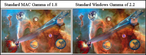
The next term to be discussed is that of monitor gamma. Monitor gamma is basically the numerical representation of a monitor=s contrast and brightness level. 2.2 is the gamma for Windows' monitors and is the default target gamma of many colorimeters used for creating profiles for monitors. An image on a monitor set for a gamma of 1.8 appears lighter than an image on a monitor with a gamma of 2.2. Many monitors for MACs have or had in the past a gamma of 1.8.
How does all of this affect the user. Let's start by talking about digital cameras. The default for the Canon Rebel XT was for a color space of sRGB and for the output to be in jpg format. While you can get excellent results, there is more information if you use Camera RAW as your output and use a wider color space of Adobe RGB.
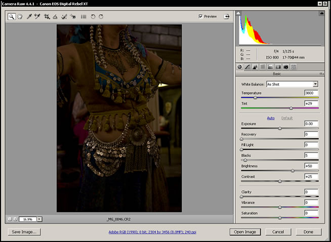
The next question could be why use Camera RAW. Through trial and error, I have found that the tonal range is greater and there is a lot more information available. For example, if an image taken with a jpg out put is grossly underexposed, there is only so much you can do to correct it. However, with Camera Raw you can increase the "exposure" of the image with software that works with Camera RAW images. You can, also, globally modify highlights, shadows, etc. Adobe Photoshop deals with Camera RAW images as does Adobe Lightroom and software that often comes with a digital camera. Below is a very underexposed image in Photoshop CS3
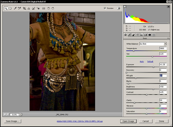
Here is the image very quickly adjusted. I could have done more fine-tuning to it. (Ignore all the clutter in the background of the image. This is only an example of how to save a poorly exposed image.)
I have specifically not discussed color management policies for software such as Adobe Photoshop and others. How it is set up depends on how it is used by the individual or by a team.
Quickly stated, it is a very good idea to calibrate your equipment. Start with your monitor and printer. I like the Datacolor products. See my reviews on the Spyder3Elite™ and on the Datacolor 1005™ Spectrocolorimeter. I use the same color space in my digital camera as I use in Photoshop. Also, if you are using a scanner, and you know that your monitor is calibrated and the profiles for your printer produce good results, make sure that your scanner is also part of the process. You can easily do this roughly by printing an image and scanning it back. If it doesn't look like the image on the monitor or the printed image, adjust the scanner and save the configuration. This is not a scientific way of doing it, but it roughly works. There are targets that are made to be printed and used to calibrate scanners. Basically if one understands the concepts, one can control their output especially with the correct tools. Before calibration was so affordable and readily available, I calibrated my CRT monitors by hand. Now, I recommend that one uses the commercial products.