I came across some expressions created by John Derry in one of his Corel tutorials. He was describing creating a painting from a photograph and he used the phrase ".....visual metaphor or representation..." I'd like to add or substitute the word interpretation for representation.. What I believe everyone should ask themselves when creating an image - whether taking a photo, using a painting program such as Corel's Painter 11 or combining many images in Photoshop - is "What is the visual metaphor I want to present?" Granted there are times when you just want to document something, but that can also be done artistically if you keep in mind the words visual metaphor.
In this same tutorial, John Derry uses the terms "Transposing Visual Vocabularies" to relate to the fact that every medium has a specific vocabulary to describe what one is doing. I will use those words a little differently than he did. I would like to use them to describe the potential of what one can do and see in an image. We can take what the camera sees, the particular lens we choose to use, the lighting that is present, etc. and see an image that makes use of what is captured but has a metaphorical or emotional meaning.
Composition is the first tool. However, with the advent of the "megapixel" and larger sensor DSLR (digital) cameras, we can manipulate and change the image in Photoshop. I think that is why I have such trouble looking at poorly composed images. There is little reason for it even if the original shot lacks good composition. When I used to be behind the camera lens, the camera and I were one. Unfortunately, I have never felt that with digital cameras because controlling them for me is too automatic. If I use the manual controls, I have to manipulate so many dials and buttons that the image by then is basically "lost." I miss the manual controls on my Nikon film cameras. It was easier for me to compose and make use of all the factors such as depth of field, exposure, etc. on my old film cameras. But I digress. Anyway, what do I do if I see a scene I like? I take a number of images whose composition I like as seen through the lens. Then, I take some wider shots so if I am not satisfied, I do have more to work with in changing the composition later. I can do this by adding elements to a scene (combining parts of different views) or just recompose the wider angle shot. Yes, perspective will different with different lenses and at different focal lengths, but I am not speaking about going from telephoto to super wide angle. I am just speaking about including more in the scene than a tightly composed view. The important factor is that what I am doing is not guess work.
On the computer screen the composition can look different than through a lens due to many factors. Some of these are that you aren't seeing the whole image through the lens. Also, your eye has adapted to the scene before you take the image. And, then, there is depth of field and exposure. We see a blue sky, but it doesn't always show up as the same blue in the photograph. Clouds, haze, or pollution might be blanketing the horizon, but visually we see a blue sky overhead. However, in the image it isn't there.
So whether you are happy with a composition out of the camera, need to crop it a little or create a totally new composition from a wider shot, that is the first step. While there are a number of "Rules of Composition" such as the rule of thirds and others, I am not going to go into these in any depth in this article. There are many good articles on the web. I will briefly show a few examples and give a few hints on what to do and what not to do. Below shows an example of the Rule of Thirds. The white crosses show where you want your major elements to appear if you have more than one. If you have one element, you want it to appear near one of these intersections.
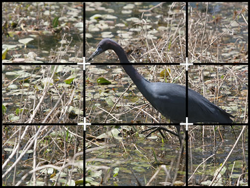
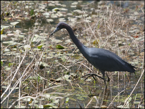
Next, you want your image not to be looking off of the canvas unless there is a specific reason or "metaphor" you want to get across in the image. Notice how there is more space in front of the bird than behind. Vertically, the bird has both space above his head and below his feet, but the space is not equal.

If the bird had been white, then the branches would have seemed to be a part of the bird, and I would not have even considered taking the photograph. I didn't want the whole background blurred out evenly, so I tried to find the distracting areas and applied a graduated blur to them. I used the new Alien Skin's Bokeh plugin for this as well as various tools in Photoshop.
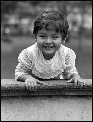
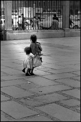
What about a bull's eye shot? Is it always wrong. No, there are many times when you intentionally break the Rule of Thirds. But if you have a feel for it, you will know when to break it. In this next image, I framed it for a bull's eye image. To me it was more powerful that way. Notice, though, it is not an exact bull's eye because her head is turned slightly and in the direction of the turn, there is a little more space, as there is with the placement of her hands.
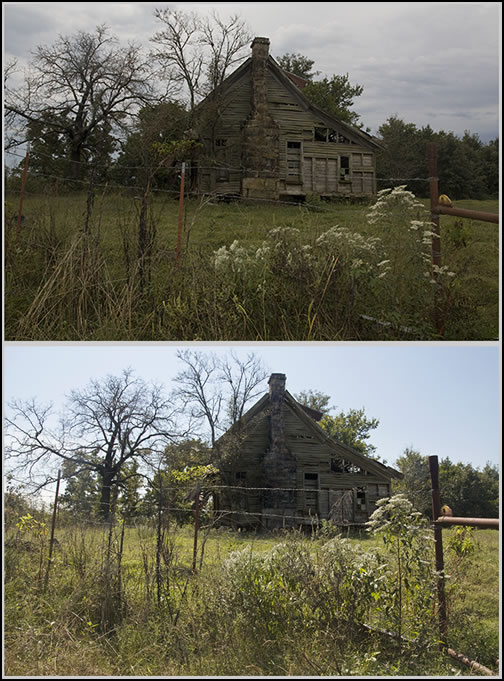
Lighting sets the mood. In Photoshop we can change the lighting of an image without adding lights. Through color, saturation, adjustment levels and curves we can determine if an image is moody or bright and cheerful. The following two images started out with a bland non-descript sky on a bland day. Even though the composition is a little different, the images from the camera were basically the same tone. Notice how in the overcast picture the house is lighter than in the picture creating a bright day. I intentionally wanted to overpower the details of the house by the bright day; whereas in the picture with the overcast sky, I wanted the details of the house to be more prominent. To me, this helped set the mood. This is what I mean by visualization or the metaphor of the image.
We can, also, add a light directly to the image. This was done in Auto FX's Mystery Lighting. The light is not real and is not meant to be. It is meant to help make the statement of what I wanted the picture to emotionally represent.
Do I always have a metaphorical image in mind when I am taking a photograph? With the advent of Photoshop, the answer is usually but not always. With black and white film and a darkroom the answer was Yes because I had to be more precise in my exposure, etc. While there is a lot of room in the darkroom for creativity, one only needs to look at Ansel Adam's brilliant work, still when working with 35 mm negatives, there was only so much you could do since you had to process the roll of film equally. (Ansel Adams worked with much larger formats). While one could change the mood in the darkroom, one was still limited, so the image had to be "more complete" in the camera than it has to when using a digital camera and programs such as Photoshop. I am grateful that I learnt through black and white work and simultaneously in the darkroom. My husband has similar things to say about working with slides and Kodachrome and having to take more exact exposures. I mainly worked in black and white film when I started and, thus, had leeway in the area of exposure even though I wanted highlights that were not burnt out and details in the shadows. Working with color and black and white are different in other ways. In black and white the tonal qualities of the images and how they would reproduce on the grayscale were necessary to know. Also, shadows and highlights were treated differently than they are when shooting color film as are shapes of images. In a color image, you can have a bright red and a bright green side by side and they will be distinct. In a black and white image they won't. As they used to say, in color film, color creates a large portion of the image; in black and white it is the shapes, shadows, and highlights. That is why just converting an image from color to black and white does not always make for a successful image.
One of my pet peeves is that so many people taking pictures today believe that all of their images are worthy of putting up on the web be it in a gallery like Flickr or on their own website. My basic question is "do they know the difference between a good image and a bad one?" We are not talking about subjective choice. I might not like an image, but it can be a good image; it just maybe doesn't say anything to me. Have these same people taken any of their images with an idea in mind or a concept? I remember when we shot black and white rolls of 35 mm 36 exposure film and we were making contact sheets. We circled in china marker those shots that we would print. 3 shots per roll was considered very successful. If I were covering an event where people wanted to buy pictures of the event or the newspaper I worked for wanted a whole section on the event, I was able to use more even if I was not happy with each one as an artistic image. I remember throwing shots in the trash that I didn't like and people saying, "Oh can I have them since you don't want them?" I never would give them away, not because they would have been a free giveaway, but because they were poor shots or poorly developed, etc.
I guess to sum up what I am saying:
- Think about what you want your picture to say before you take it.
- Be aware of composition and where you place the elements in your photograph.
- Be aware of the light and the source. Is it harsh, soft, even?
- Make sure that your exposure will give you good highlights and shadows - bracket if necessary.
- Use the digital programs at your disposal to finish creating your vision whether it is in print or for the web.
- Know presentation and how to tailor an image for print or for the web. Yes, there is a difference.
- Have fun and experiment.
- Be critical of your own work. Put aside what isn't good. Present your best self not all of yourself!
There is so much to learn and so many ways to create your metaphor of an image. Remember that no two people can ever create the same original image. What you do, describes who your are. Lastly, while art is subjective, there are still criteria which, I believe, can be and should be applied to an image.