|
Creating good prints has always been very important
to me. This started in the darkroom where I worked to create
as technically perfect black and white images as I could.
Sometimes I even under and overexposed 35 mm film so I could
over and under develop the film depending upon the conditions.
I worked on techniques to create "velvety black feeling"
images.
I took this same concern with me when I began
to work on the computer. Initially, I had very little to work
with. We did not have real profiles for desktop printers.
Color management was still in its primitive stages, and to
get a print to match a monitor and the monitor to represent
a color correctly was not easy. Now, of course, things are
very different. But many concepts are still the same. I am
going to spend the next few weeks writing a series of articles
on various aspects of desktop printing and scanning. They
will be quasi-tutorials and will deal with the characteristic
of color, image resizing and resampling, some tips on scanning
using the Nikon SuperCool Scanner 4000 ED and how best to
take pictures for scanning, the questions surrounding archival
printing, and possibly some new techniques of printing. Of
course, these topics can change and will not necessarily be
in the order presented.
I want to start with the basics and the basics
all go back to Color. To have control over printing,
it helps to understand color. It helps to know the relationship
between the colors seen on a monitor and those produced by
a printer.
Understanding color on the computer can be a
bit tricky since the computer and its peripherals make use
of more than one type of color model or color space. This
article will address two types of color spaces - additive
and subtractive and explain how they interact and function.
Additive colors are the colors that are inherent
in light. They are the colors indigenous to monitors, digital
cameras, and scanners. The human eye, also, sees these colors.
They are red, green, and blue (RGB). They are called primary
additive colors because when added together, they form white.
Subtractive colors are those used in the printing
trades such as dyes, inks, and pigments. The term color
separation should be familiar to most people. These colors
are cyan, magenta, and yellow. These colors are called absorbing
or subtractive colors since when light is absorbed by all
of them, they produce black. These are the colors used in
printers. (Although the normal printers made for home use,
do not exactly follow this rule. This exception will be commented
on briefly at the end of the article.) These colors are commonly
referred to as CMY colors. However, usually one sees CMYK.
K stands for a truer black since when 100% of C, M, and Y
are combined, the resulting color is a muddy dark brown. All
of these colors are related. For example:
               white = red + green + blue            black = cyan + magenta + yellow
               cyan = green + blue                   red = yellow + magenta
               magenta = blue + red                  green = yellow + cyan
               yellow = red + green                  blue = cyan + magenta
The above list should show an emerging pattern
- one of interrelationships. RGB and CMY colors form
a complementary relationship.
                                 Red.........Cyan
                                 Green.......Magenta
                                 Blue........Yellow
Thus, if one has an image that contains
yellow and one wants to intensify the yellow, one can add
more yellow or one can subtract blue. The best way to understand
complementary colors is to set up an image and manipulate
the individual colors.
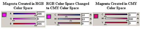
The following were created in Adobe Photoshop
to demonstrate that the two color spaces are not exactly
alike. That is why an image on a monitor does not always
look the same when printed. (Other factors are also at work.)
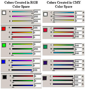
The following illustration shows how RGB colors
appear to be different when created in different color spaces.
In the next set of examples, notice how CMY
colors vary depending in which color space they were created.
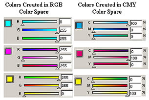
The following examples show how the two color
spaces are different. Notice how the maximum amounts of
blue and the maximum amounts of red form magenta in RGB
color space. When this space is converted to CMY space,
the color is not the same as if it were originally created
in CMY color space.
As stated previously, although the ink in
home printers is CMYK ink, most use RGB color space for
printing. However, for proofing work that will be output
to a commercial printer, a CMYK color space is used. What
this means is that the latter is being set up to imitate
a "professional or commercial" printer while the
former color space is more for "home" use since
most people work in RGB and not in CMYK color.
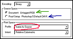
The above screen capture is from the Adobe Photoshop
6 Print screen. The Print (Color) Space that is circled
in red states "Same As Source". The source can either
be "Document Untagged RGB" (green arrow) or "Proof
Setup: Photoshop 5 Default CMYK" (blue arrow).
The problem with color perception does not end
here, unfortunately. All one needs to do is look at a piece
of work under tungsten light, under florescent light, and
under daylight. None of the colors will look the same.
If you know the source of light that will be
used to view your work, then use that source as your guide.
If not, try to use a combination. For instance, daylight florescent
lights can be purchased. Or work can be viewed near a window
in the middle of the day but under a tungsten lamp. In other
words, use a combination of lights. Get to understand how
these lights will change the perception of the colors. One
can continue that various inks, printers, monitors, papers,
etc. all play a part in determining color output. While this
is true, one has to stop somewhere. Basically, if one understands
colors and how they are related and what makes them change
or appear to change, one can work with them with a decent
degree of accuracy.
How colors look on my monitor are extremely
important to me. As computing has progressed into the gaming
and 3D area, the emphasis in video cards has been toward speed,
3D, and animation. Monitors are advertised as being super
bright. I have experienced some of these and went through
a number this last time I upgraded until I could get ones
that had good color reproduction and weren't so bright that
I needed sunglasses. Since I concentrate on what I will call
non-animation, I use Matrox video cards, the Parhelia for
my main machine since I use two monitors. While it is not
known for its 3D animation or gaming capabilities, its color
representation is excellent and it holds its own in the other
areas. I also found that the ViewSonic P95f is an excellent
moderate priced monitor. There might be better ones on the
market, but it is very hard to test monitors in ones own home
and be able to return them if you just don't like them, so
that is why I pass on my experience.
I am very often asked what is the best resolution
for printing and how can I print this picture that was sent
to me over the web. My next article will deal with the two
R's -Resizing and Resampling and how they are related.
|